Run and Experiment summaries
- Run summaries shipped
- Nov 2025
- Experiment summaries shipped
- Feb 2026
- Tabs to answer whether a run is okay
- 5 → 1
Scientists had all the data for a run, and no single place to see how it was doing.
Five tabs to answer one question.
A run in Invert has sensor data (temperature, pH, dissolved oxygen), offline measurements (cell density, titer), a log of operator actions and alerts, and lineage back to the seed train. All of it was in the product, but spread across a metrics tab, a properties tab, an events tab, a lineage tab and the Analysis view.
Checking on a run meant opening it, reading the metrics tab, going to events to see what happened at hour 67, going to Analysis to plot the pH trace, and looking up the target titer somewhere else. Scientists were doing this several times a day across multiple reactors.
Experiments had the same problem at a larger scale. An experiment is a set of runs testing factors against each other, often a full factorial design with a dozen or more conditions. To understand one, you opened the runs one at a time and compared them yourself.
One page, read top to bottom.
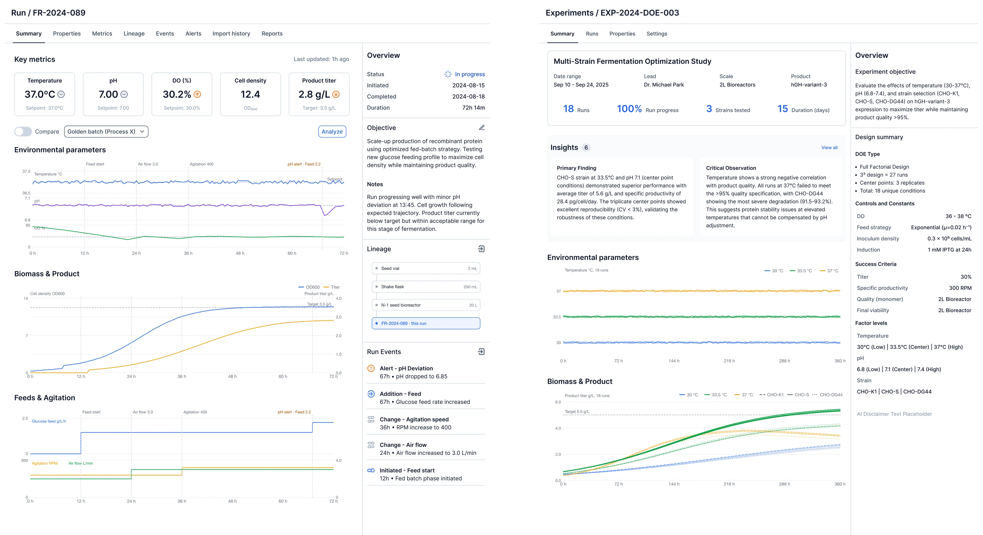
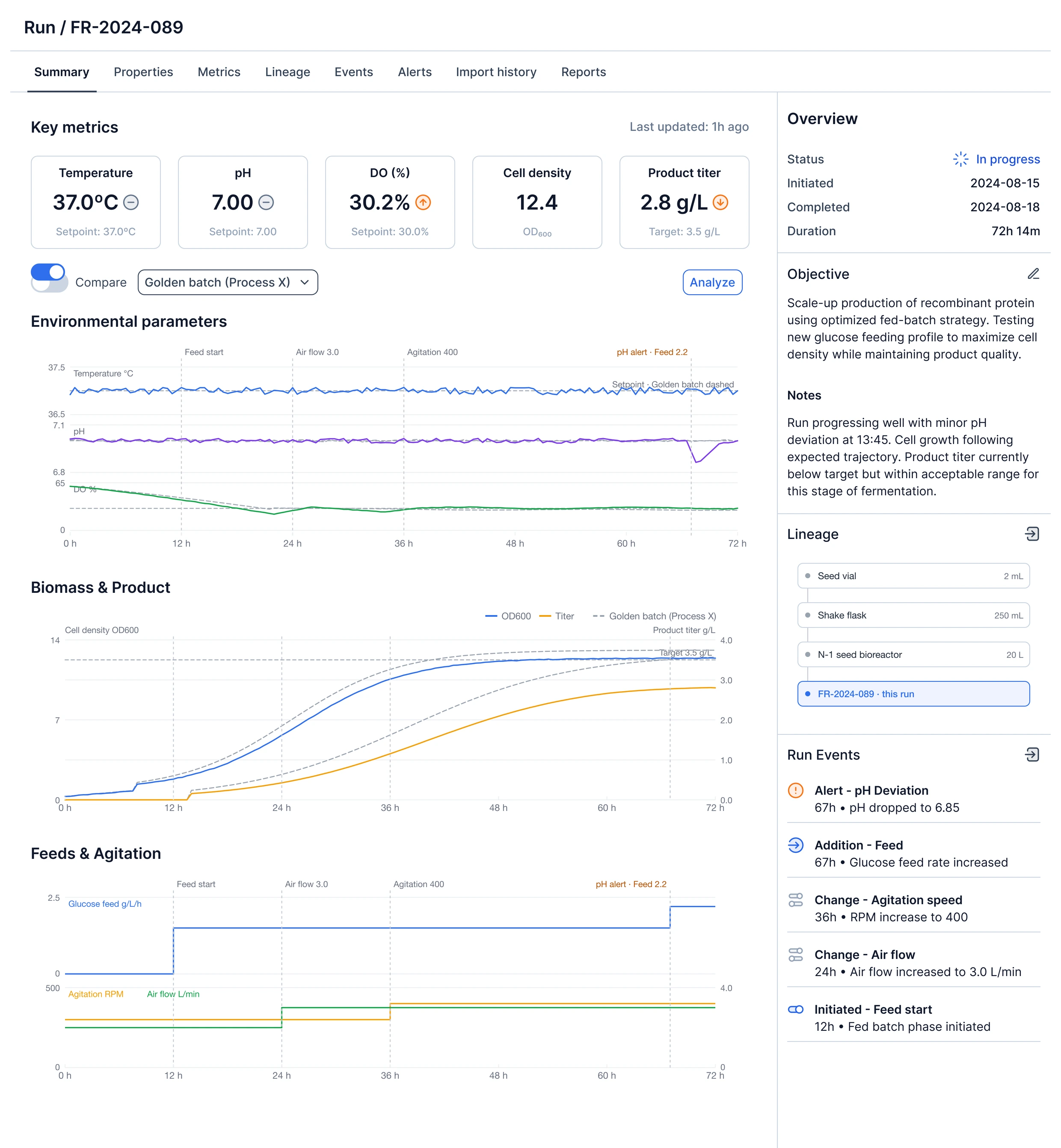
The Summary tab is meant to be read quickly. The KPI tiles show the current value next to the setpoint or target with an up, down or steady indicator. The charts are previews and each one links to the full Analysis view. A scientist should be able to look at the tile row and decide whether to keep reading or move on.
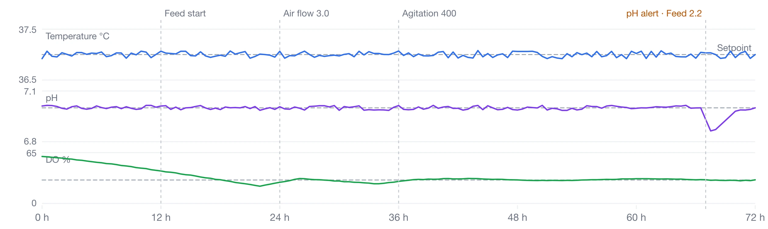
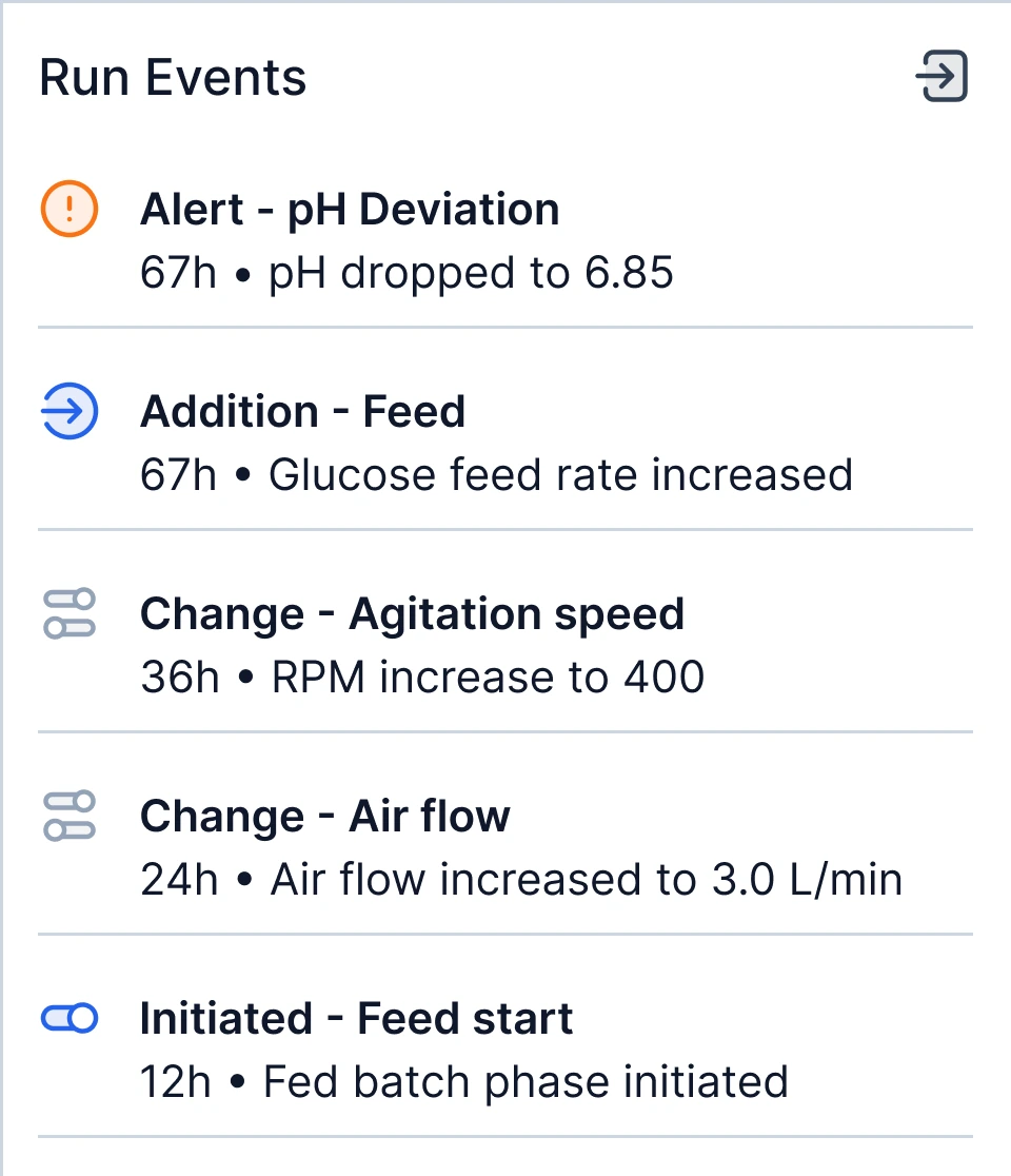
The run events panel sits beside the charts and the events are marked on the charts themselves. A pH alert at 67 h and a feed rate change at 67 h are just two list items until you see them on the pH trace and the feed chart. Connecting what the operator did to what the process did is most of bioprocess troubleshooting, and before this page you had to plot it yourself.
Scientists judge a run against the best previous run of that process. A Compare toggle overlays that run on the environmental and product charts, time aligned. With it on, a titer of 2.8 becomes a titer that is 0.8 below where the good run was at this point.
The Run summary. One page for how a run is doing: the key numbers, previews of the charts, and what happened.
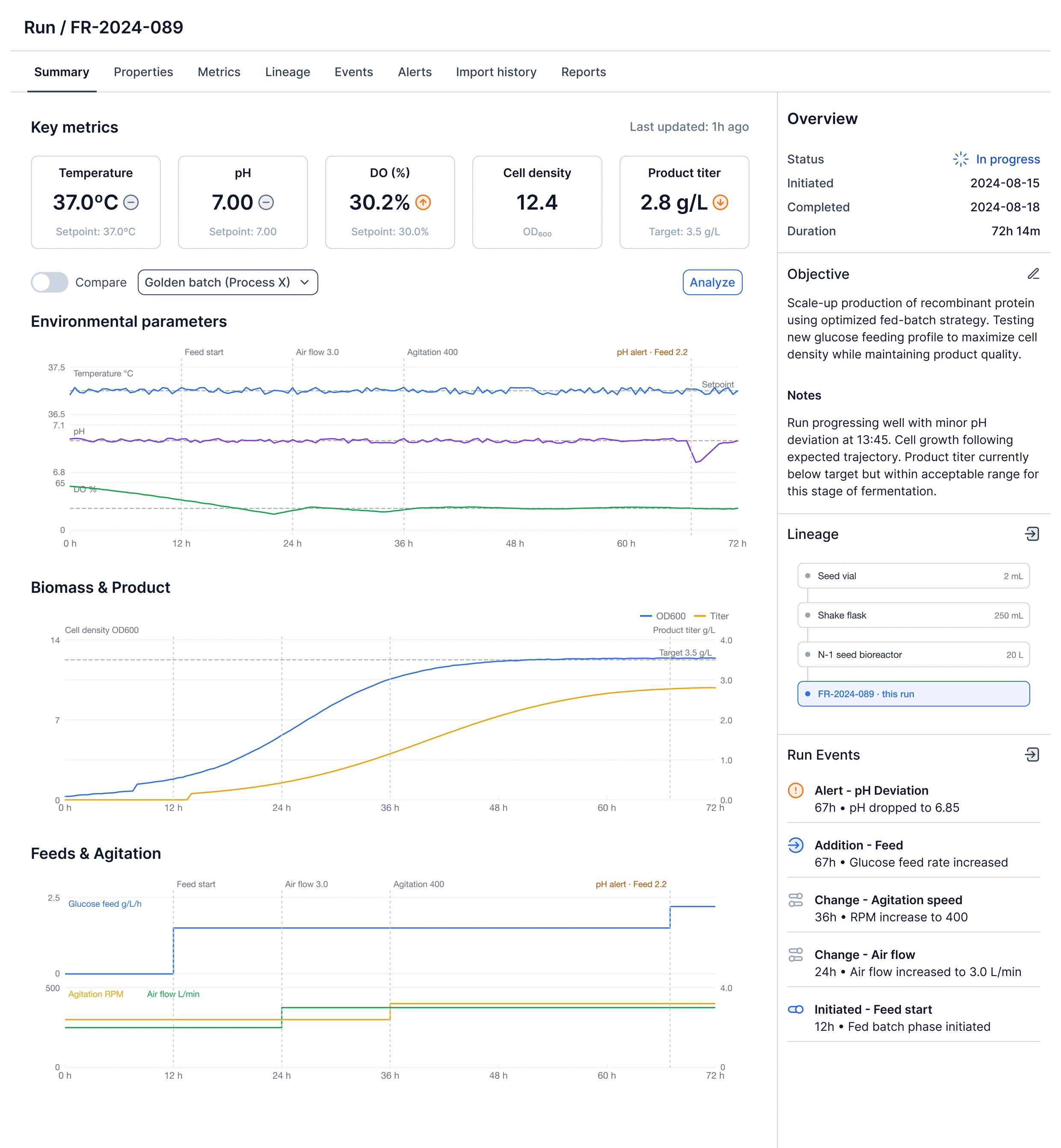
The key numbers against their setpoints, with an up, down or steady indicator. Enough to decide whether to keep reading.

A preview chart, with the run’s events marked on it. The pH dip at 67 h is the alert in the list.
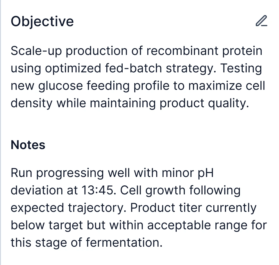
The objective and notes, written by AI from the run’s data and events. Labeled, editable in place, and regenerable.
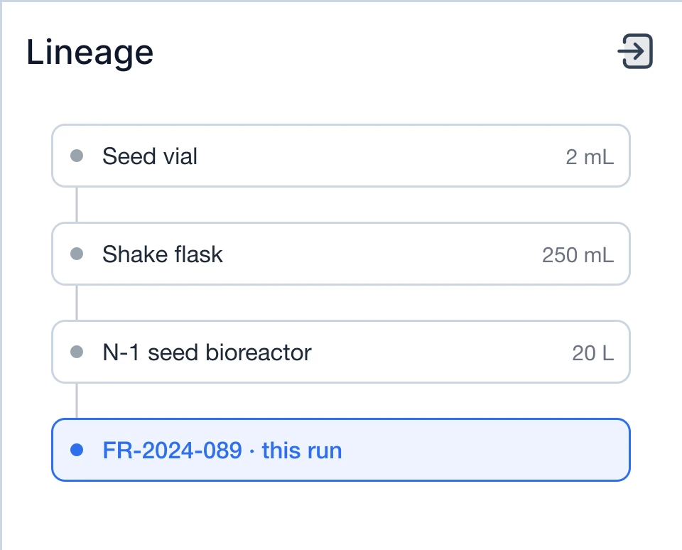
Where the run came from: the seed train, back to the vial.
What the operator did, and when. Every one of these is on the charts.
Laid flat: the numbers, a chart, the words, the lineage, the events.
Back on the page.
Compare on. The golden batch overlaid, time aligned: a titer of 2.8 is now 0.8 below where the good run was at this point.
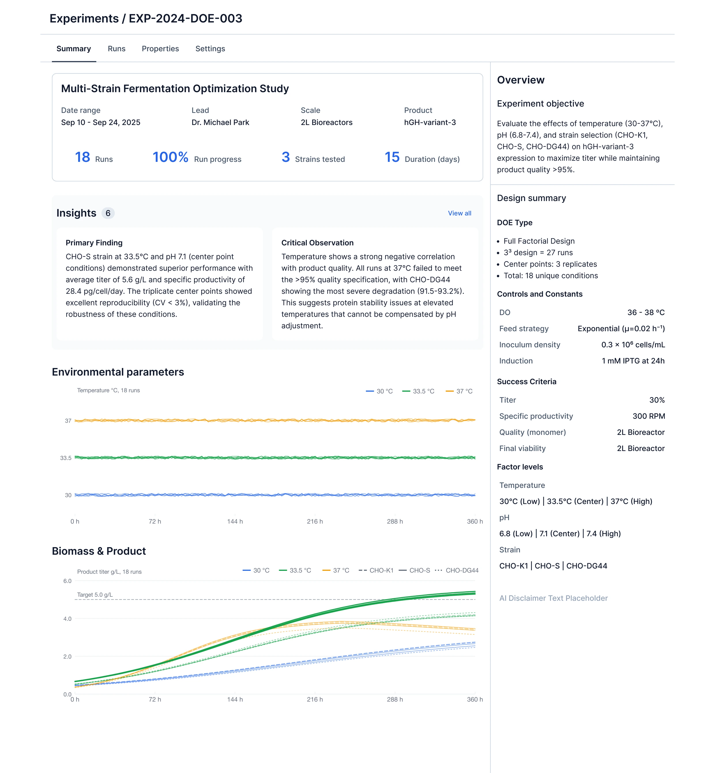
Three months later, the Experiment summary. The same structure, with different contents in it.
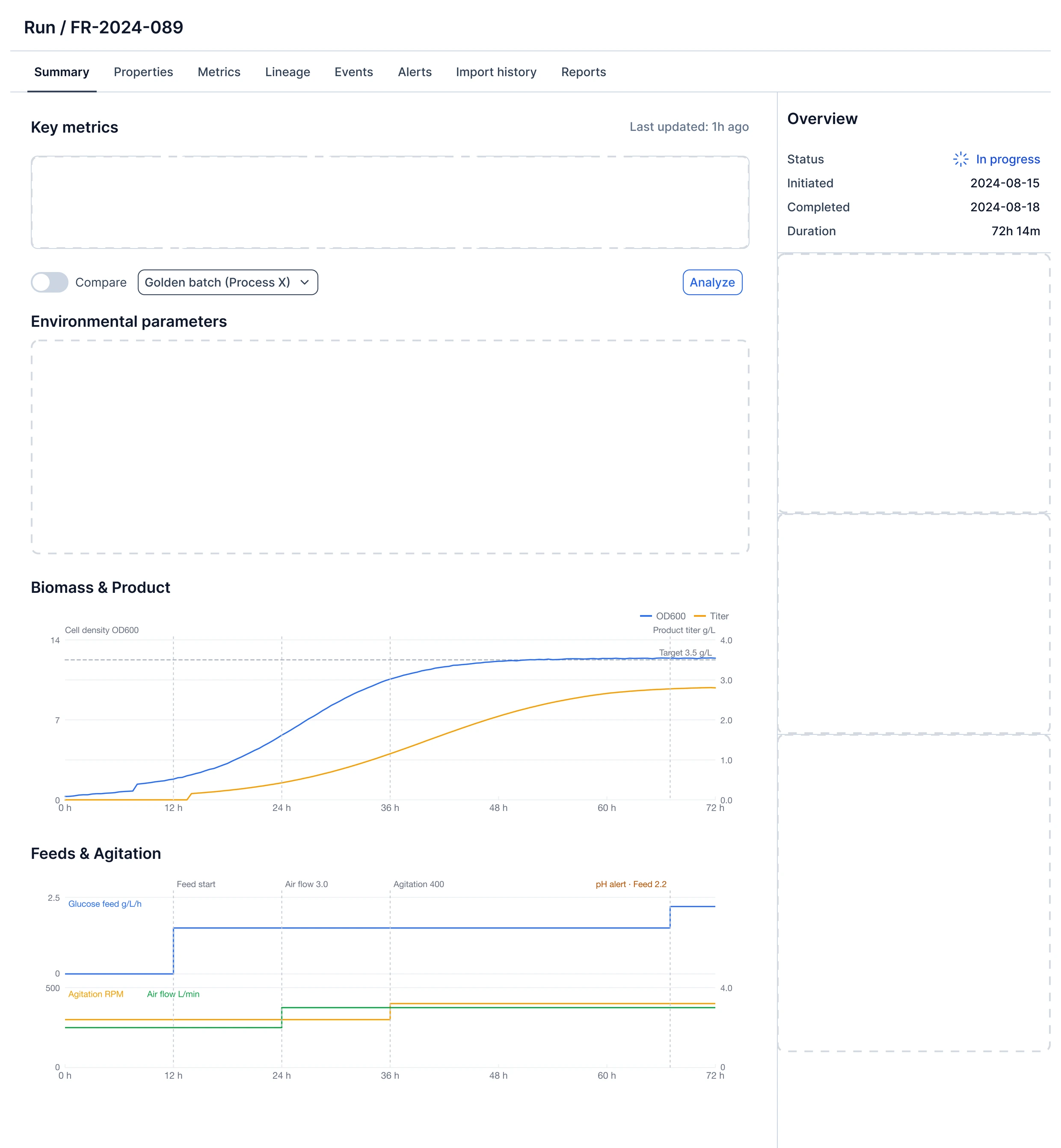
The Run summary tips into an isometric view and five parts lift off it one at a time, leaving empty slots behind: the KPI tile row, the environmental chart with its event markers, the objective and notes, the lineage graph, and the run events. The page falls away and the parts settle flat in a column, then drop back in. The Compare toggle switches on and the golden batch appears on the charts as grey dashed lines. Then the page falls away and the Experiment summary assembles out of isometric in its place, with the same layout: tiles at the top, an overview panel on the right, chart sections below.
AI writes the objective and notes, with rules.
The Objective and Notes on the run summary are generated from the run’s data and events. This was the first place Invert put AI-written text on a page scientists rely on, and it is where I set the rules that later applied to AI content across the product.
It is labeled as AI generated, the same way everywhere. It can be edited in place. It can be regenerated. It shipped opt-in per organization.
Experiment summaries go further. Instead of a narrative they show Insights: a primary finding, a critical observation, missing data, each written from the results across runs. An insight is a conclusion, so it needs more trust than a run objective does. The same rules apply, and the insight cards sit directly above the charts that support them so the scientist can check the claim against the data.
The same layout for experiments.
The Experiment summary uses the same page structure as the Run summary: content column on the left, overview panel on the right, tiles at the top, chart sections below. The contents change. The run panel has status, objective, notes, lineage and events. The experiment panel has the objective, the design of experiments (factor levels, controls, success criteria) and the AI disclaimer.
Run charts show one timeline with events. Experiment charts overlay every run in the study, colored by the factor being tested, so the effect of temperature shows up as three bands rather than eighteen separate lines.
Keeping the structure the same meant anyone who had used the run page already understood the experiment page. It also meant the second feature took much less design time than the first.
I mapped the available data against what the page needed, using Claude Code to read the data model. I laid out the page in Figma, built a functional front-end branch in Cursor, and iterated with the PM on the running page. Engineering wired the backend to the components I had specified, in the same branch.
I do this for data-heavy pages because a static mockup does not show real density, real chart proportions or the edge cases (a run with no events, an experiment with runs still going). Those only show up when the page is running with real data.
Shipped twice, three months apart.
- Run summaries, opt-in for AI-enabled organizations
- Nov 2025
- Experiment summaries, same organizations
- Feb 2026
- Tile, panel and events layout reused for Projects
- Jul 2026
Run summaries shipped in November 2025 as an opt-in for AI-enabled organizations. Experiment summaries shipped in February 2026 for the same organizations. The tile, panel and events layout was reused for Projects in July 2026.